The Chart Tool Panels allow users to change the selected chart type and customise the data and chart formatting.
The Chart Tool Panels are accessed by selecting Edit Chart from the Chart Menu in the top-right corner of the chart. Note they can also be opened via configuration (see examples in this section), or programmatically through the Grid API, see Open / Close Chart Tool Panels.
Chart Tool Panel Copy Link
The Chart Panel can be used to change the chart type and chart theme.
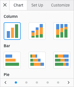
Chart Panel
It is possible to configure which chart groups and chart types are included and in which order via the chartToolPanelsDef grid option:
Allows customisation of the Chart Tool Panels, such as changing the tool panels visibility and order, as well as choosing which charts should be displayed in the chart panel. |
Note that the Chart Panel key is settingsPanel.
The full list of chart groups with the corresponding chart types are shown below:
interface ChartGroupsDef {
  columnGroup?: ('column'  |  'stackedColumn'  |  'normalizedColumn')[];
  barGroup?: ('bar'  |  'stackedBar'  |  'normalizedBar')[];
  pieGroup?: ('pie'  |  'donut'  |  'doughnut')[];
  lineGroup?: ('line'  |  'stackedLine'  |  'normalizedLine')[];
  areaGroup?: ('area'  |  'stackedArea'  |  'normalizedArea')[];
  scatterGroup?: ('scatter'  |  'bubble')[];
  combinationGroup?: ('columnLineCombo'  |  'areaColumnCombo'  |  'customCombo')[];
  polarGroup?: ('radarLine'  |  'radarArea'  |  'nightingale'  |  'radialColumn'  |  'radialBar')[];
  statisticalGroup?: ('boxPlot'  |  'histogram'  |  'rangeBar'  |  'rangeArea')[];
  hierarchicalGroup?: ('treemap'  |  'sunburst')[];
  specializedGroup?: ('heatmap'  |  'waterfall')[];
  funnelGroup?: ('funnel'  |  'coneFunnel'  |  'pyramid')[];
}
The contents and order of chart menu items in the Context Menu will match the ChartGroupsDef configuration.
The example below shows a subset of the provided chart groups with the chart types reordered. Note the following:
- Only the Pie, Columns and Bar chart groups are shown in the chart panel.
- Only the Pie, Columns and Bar chart groups are shown in the Context Menu when you right click the grid.
- Note the order of the chart groups and their chart types matches the order they are specified in
chartGroupsDef. - The Chart Panel is configured to be open by default via
defaultToolPanel: 'settings'.
Set Up Tool Panel Copy Link
The Set Up Panel can be used to change the chart category and series. It is not applicable for Pivot Charts.
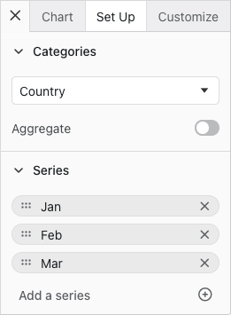
Chart Set Up Panel
It is possible to configure which groups are shown, the order in which they appear and whether they are opened by default via the chartToolPanelsDef grid option:
Allows customisation of the Chart Tool Panels, such as changing the tool panels visibility and order, as well as choosing which charts should be displayed in the chart panel. |
Note that the Set Up Panel key is dataPanel.
The default list and order of the Set Up Panel groups are as shown below:
const chartToolPanelsDef = useMemo(() => {
	return {
        dataPanel: {
            groups: [
                { type: 'categories', isOpen: true },
                { type: 'series', isOpen: true },
                { type: 'seriesChartType', isOpen: true }
            ]
        }
    };
}, []);

<AgGridReact chartToolPanelsDef={chartToolPanelsDef} />
The seriesChartType group is only shown in Combination Charts.
The following example shows some Set Up Panel customisations. Note the following:
- The Categories group is not included.
- The Series group is closed by default.
- The Set Up Panel is configured to be open by default via
defaultToolPanel: 'data'.
Customize Tool Panel Copy Link
The Customize Panel allows users to format the chart where the available formatting options differ between chart types.
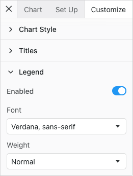
Chart Customize Panel
It is possible to configure which groups are shown, the order in which they appear and whether they are opened by default via the chartToolPanelsDef grid option:
Allows customisation of the Chart Tool Panels, such as changing the tool panels visibility and order, as well as choosing which charts should be displayed in the chart panel. |
Note that the Customize Panel key is formatPanel.
The default list and order of format groups are as follows:
const chartToolPanelsDef = useMemo(() => {
	return {
        formatPanel: {
            groups: [
                { type: 'chart', isOpen: false },
                { type: 'titles', isOpen: false },
                { type: 'legend', isOpen: false },
                { type: 'horizontalAxis', isOpen: false },
                { type: 'verticalAxis', isOpen: false },
                { type: 'series', isOpen: false },
            ]
        }
    };
}, []);

<AgGridReact chartToolPanelsDef={chartToolPanelsDef} />
The selected chart determines which groups are displayed. For example, a pie chart does not have an axis so Axis groups will not be shown even if they are listed in chartToolPanelsDef.formatPanel.groups.
For chart types that have both horizontal and vertical axes, the axis group can be replaced with the more specific horizontalAxis and verticalAxis groups to control these options independently.
The following example shows some Customize Panel customisations. Note the following:
- The customize panel groups have been reordered.
- The Horizontal Axis group is open by default.
- The Title and Legend groups have been omitted.
- The Customize Panel is configured to be open by default via
defaultToolPanel: 'format'.
Omitting & Ordering Tool Panels Copy Link
The Chart Tool Panels can be omitted and ordered using the chartToolPanelsDef.panels grid option:
const chartToolPanelsDef = useMemo(() => {
	return {
        panels: ['data', 'format', 'settings'], // default order
    };
}, []);

<AgGridReact chartToolPanelsDef={chartToolPanelsDef} />
To hide the Chart Tool Panels, the chartToolPanelsDef.panels grid option can be set to an empty array:
const chartToolPanelsDef = useMemo(() => {
	return {
        panels: [], // No Chart Tool Panels are shown and Edit Chart is removed from the Chart Menu
    };
}, []);

<AgGridReact chartToolPanelsDef={chartToolPanelsDef} />
The following example shows how the Chart Tool Panels can be omitted and ordered. Note the following:
- The Customize Tool Panel has been omitted.
- The Set Up Tool Panel appears before the Chart Tool Panel.
- The Set Up Panel is configured to be open by default via
defaultToolPanel: 'data'.
Chart Tool Panel API Copy Link
The Chart Tool Panels can be opened and closed programmatically using the following grid APIs:
Open the Chart Tool Panel. |
Close the Chart Tool Panel. |
The example below demonstrates how you can open and close the Chart Tool Panels.
- Click Open Chart Tool Panel to open the default
Charttab viaopenChartToolPanel() - Click Open Chart Tool Panel Customize tab to open the
Customizetab viaopenChartToolPanel() - Click Close Chart Tool Panel to close via
closeChartToolPanel()