Cross-filtering charts allow users to interact with data in an easy and intuitive way. Clicking on chart elements automatically filters values in both the grid and other cross-filter charts.
This built-in feature of integrated charts is particularly useful for creating interactive reports and dashboards.
Creating Cross-filter Charts Copy Link
Cross-Filter charts are created programmatically using createCrossFilterChart(params) on the grid's API.
Used to programmatically create cross filter charts from a range. |
The following snippet shows how a cross-filtering pie chart can be created:
gridApi.createCrossFilterChart({
    chartType: 'pie',
    cellRange: {
        columns: ['salesRep', 'sale'],
    },
    aggFunc: 'sum',
});
Note in the snippet above that the sale values are aggregated by the salesRep category as aggFunc: 'sum' is specified.
A corresponding column configuration for the chart above is shown in the following snippet:
const [columnDefs, setColumnDefs] = useState([
    { field: 'salesRep', filter: 'agSetColumnFilter', chartDataType: 'category' },
    { field: 'sale', chartDataType: 'series' },
]);

<AgGridReact columnDefs={columnDefs} />
Cross-filtering Charts only support Client-Side Row Model. Grid filtering needs to be enabled on the category column(s) with either a Set Filter or Multi Filter. It is also important to define the Chart Data Type as it's not possible to infer the type when all data is filtered out.
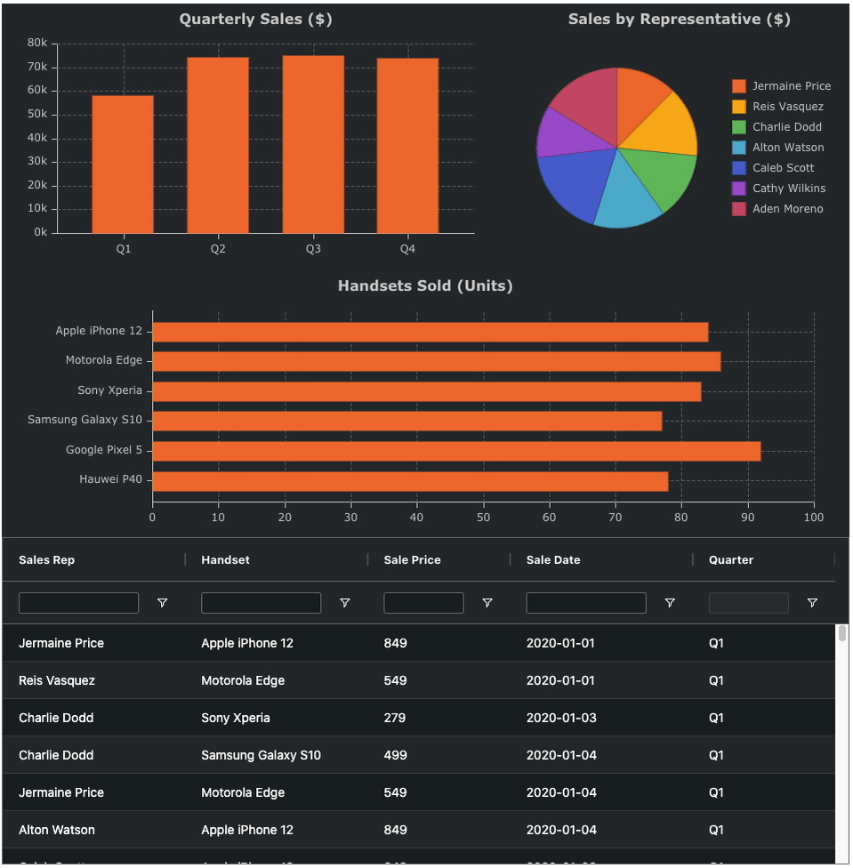
The following example shows how to create a simple cross-filtering pie chart. Note the following:
- Click on a sector of the pie chart to filter rows in the grid by the selected sales rep.
- Ctrl (Cmd) Click on another sector to additionally adds rows corresponding to the selected sales rep.
- Click Chart Background to remove / reset the filtering in the grid to restore all rows in the grid.
Cross-filter API Copy Link
The cross-filter api shares a similar api to Range Chart, however there are different defaults which make sense for cross-filtering.
Used to programmatically create cross filter charts from a range. |
Properties available on the CreateCrossFilterChartParams interface.
The type of cross-filtering chart to create. |
Defines the list of columns to be charted. Note that cross-filter charts include all rows in the grid so there is no need to specify the range of rows. |
By default, when a cross-filter chart is displayed using the grid, the grid will not highlight the range the chart is charting when the chart gets focus. To show the chart range set suppressChartRanges=false. |
The aggregation function that should be applied to all series data. The built-in aggregation functions are 'sum', 'min', 'max', 'count', 'avg', 'first', 'last'. Alternatively, custom aggregation functions can be provided if they conform to the IAggFunc interface shown here. |
By default (or when true), the order in cross filter charts will match grid sorting. Set to false to disable sorting for this chart. Set to a SortModelItem[] to provide a custom sorting for this chart. |
The default theme to use for the created chart. In addition to the default options you listed, you can also provide your own custom chart themes. Options: 'ag-default', 'ag-default-dark', 'ag-material', 'ag-material-dark', 'ag-pastel', 'ag-pastel-dark', 'ag-vivid', 'ag-vivid-dark', 'ag-solar', 'ag-solar-dark' |
If the chart is to be displayed outside of the grid then a chart container should be provided. If the chart is to be displayed using the grid's popup window mechanism then leave as undefined. |
Allows specific chart options in the current theme to be overridden. |
When enabled the chart will be unlinked from the grid after creation, any updates to the data will not be reflected in the chart. |
Cross-filter Chart Types Copy Link
The following examples show the different chart types that support cross-filtering:
Example: Sales Dashboard #1 Copy Link
Example: Sales Dashboard #2 Copy Link
Example: Most Populous Cities Copy Link
Example: Custom Theme Copy Link
In this example, we use a custom theme to style the charts using customChartTheme and chartTheme. See the Custom Chart Themes section for more information.
Note that for cosmetic changes in cross-filtering charts, you must use a custom theme. Cross-filtering charts rely on a theme to derive filtered value colours from existing theme colours. Specifying your own colours in the theme overrides will disable this behaviour.