
Date Filters allow you to filter date data.
Configure as follows:
<ag-grid-vue
:columnDefs="columnDefs"
/* other grid options ... */>
</ag-grid-vue>
this.columnDefs = [
{
field: 'date',
// configure column to use the Date Filter
filter: 'agDateColumnFilter',
filterParams: {
// pass in additional parameters to the Date Filter
},
},
];The example below shows the Date Filter in action:
- The Date column is using a Date Filter.
- A Date Filter Comparator is provided to parse the data and allow date comparisons to be made.
- The minimum valid year is set to
2000, and maximum valid year is2021. Dates outside this range will be considered invalid, and will:- Deactivate the column filter. This avoids the filter getting applied as the user is typing a year - for example suppose the user is typing the year
2008, the filter doesn't execute for values2,20or200(as the text2008is partially typed). - Be highlighted with a red border (default theme) or other theme-appropriate highlight.
- Deactivate the column filter. This avoids the filter getting applied as the user is typing a year - for example suppose the user is typing the year
- the
inRangeFloatingFilterDateFormatproperty has been set to define a custom date format, this is only shown in the floating filter panel when an in-range filter has been applied.
Configuration
Date Filters are configured though the filterParams attribute of the column definition (IDateFilterParams interface):
browser | Defines whether the grid uses the browser date picker or a plain text box. true: Force the browser date picker to be used. false: Force a plain text box to be used. |
buttons | Specifies the buttons to be shown in the filter, in the order they should be displayed in. The options are: 'apply': If the Apply button is present, the filter is only applied after the user hits the Apply button. 'clear': The Clear button will clear the (form) details of the filter without removing any active filters on the column. 'reset': The Reset button will clear the details of the filter and any active filters on that column. 'cancel': The Cancel button will discard any changes that have been made to the filter in the UI, restoring the applied model. |
close | If the Apply button is present, the filter popup will be closed immediately when the Apply or Reset button is clicked if this is set to true. |
comparator | Required if the data for the column are not native JS Date objects. |
debounce | Overrides the default debounce time in milliseconds for the filter. Defaults are: TextFilter and NumberFilter: 500ms. (These filters have text field inputs, so a short delay before the input is formatted and the filtering applied is usually appropriate). DateFilter and SetFilter: 0ms |
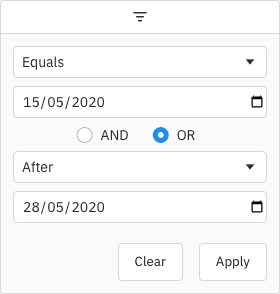
default | By default, the two conditions are combined using AND. You can change this default by setting this property. Options: AND, OR
|
default | The default filter option to be selected. |
filter | Array of filter options to present to the user.
See: Filter Options |
filter | Placeholder text for the filter textbox
|
in | Defines the date format for the floating filter text when an inRange filter has been applied. |
in | If true, the 'inRange' filter option will include values equal to the start and end of the range. |
include | If true, blank (null or undefined) values will pass the 'equals' filter option. |
include | If true, blank (null or undefined) values will pass the 'greaterThan' and 'greaterThanOrEqual' filter options. |
include | If true, blank (null or undefined) values will pass the 'lessThan' and 'lessThanOrEqual' filter options. |
include | If true, blank (null or undefined) values will pass the 'inRange' filter option. |
max | Maximum number of conditions allowed in the filter. |
max | The maximum valid date that can be entered in the filter. It can be a Date object or a string in the format YYYY-MM-DD. If set, this will override maxValidYear - the maximum valid year setting.
|
max | This is the maximum year that may be entered in a date field for the value to be considered valid. Default is no restriction. |
min | The minimum valid date that can be entered in the filter. It can be a Date object or a string in the format YYYY-MM-DD. If set, this will override minValidYear - the minimum valid year setting.
|
min | This is the minimum year that may be entered in a date field for the value to be considered valid. @default 1000 |
num | By default only one condition is shown, and additional conditions are made visible when the previous conditions are entered (up to maxNumConditions). To have more conditions shown by default, set this to the number required. Conditions will be disabled until the previous conditions have been entered. Note that this cannot be greater than maxNumConditions - anything larger will be ignored. |
read | If set to true, disables controls in the filter to mutate its state. Normally this would be used in conjunction with the Filter API. See: Read-only Filter UI |
Date Range
The example below demonstrates configuring date range filtering in the Date Filter with minimum and maximum validation dates:
- The
minValidDateparameter is set to2008-01-08using a string. - The
maxValidDateis dynamically set to tomorrow's date using JavaScript's Date object. - Together,
minValidDateandmaxValidDaterestrict the selectable date range. - Any manually entered or selected dates outside the valid range will be invalid.
Filter Comparator
Dates can be represented in your data in many ways e.g. as a JavaScript Date object, as a string in a particular format such as '26-MAR-2020', or something else. How you represent dates will be particular to your application.
By default, the date filter assumes you are using JavaScript Date objects. If this is the case, the date filter will work out of the box. However, if your date is in any other format you will have to provide your own comparator to perform the date comparisons.
The comparator function takes two parameters. The first parameter is a JavaScript Date object for the selected date in the filter (with the time set to midnight). The second parameter is the current value of the cell in the row being evaluated. The function must return:
- Any number < 0 if the cell value is less than the filter date.
- 0 if the dates are the same.
- Any number > 0 if the cell value is greater than the filter date.
This pattern is intended to be similar to the JavaScript compareTo(a, b) function.
Below is an example of using a date filter with a comparator.
<ag-grid-vue
:columnDefs="columnDefs"
/* other grid options ... */>
</ag-grid-vue>
this.columnDefs = [
// column definition configured to use a date filter
{
field: 'date',
filter: 'agDateColumnFilter',
// add extra parameters for the date filter
filterParams: {
// provide comparator function
comparator: (filterLocalDateAtMidnight, cellValue) => {
const dateAsString = cellValue;
if (dateAsString == null) {
return 0;
}
// In the example application, dates are stored as dd/mm/yyyy
// We create a Date object for comparison against the filter date
const dateParts = dateAsString.split('/');
const year = Number(dateParts[2]);
const month = Number(dateParts[1]) - 1;
const day = Number(dateParts[0]);
const cellDate = new Date(year, month, day);
// Now that both parameters are Date objects, we can compare
if (cellDate < filterLocalDateAtMidnight) {
return -1;
} else if (cellDate > filterLocalDateAtMidnight) {
return 1;
}
return 0;
}
}
}
];Once the date comparator callback is provided, then the Date Filter is able to perform all the comparison operations it needs, e.g. 'Less Than', 'Greater Than' and 'Equals'.
Filter Model
The Filter Model describes the current state of the applied Date Filter. The Date Filter Model represents the Date as a string in format 'YYYY-MM-DD', however when doing comparisons the date is provided as a JavaScript Date object as that's what date pickers typically work with. The model uses string representation to make it easier to save and avoid any timezone issues.
If only one Filter Condition is set, this will be a DateFilterModel:
If more than one Filter Condition is set, then multiple instances of the model are created and wrapped inside a Combined Model (ICombinedSimpleModel<DateFilterModel>). A Combined Model looks as follows:
// A filter combining multiple conditions
interface ICombinedSimpleModel<DateFilterModel> {
filterType: string;
operator: JoinOperator;
// multiple instances of the Filter Model
conditions: DateFilterModel[];
}
type JoinOperator = 'AND' | 'OR';
Note that in AG Grid versions prior to 29.2, only two Filter Conditions were supported. These appeared in the Combined Model as properties condition1 and condition2. The grid will still accept and supply models using these properties, but this behaviour is deprecated. The conditions property should be used instead.
An example of a Filter Model with two conditions is as follows:
// Date Filter with two conditions, both are equals type
const dateEquals04OrEquals08 = {
filterType: 'date',
operator: 'OR',
conditions: [
{
filterType: 'date',
type: 'equals',
dateFrom: '2004-08-29'
},
{
filterType: 'date',
type: 'equals',
dateFrom: '2008-08-24'
}
]
};
Filter Options
The Date Filter presents a list of Filter Options to the user.
The list of options are as follows:
| Option Name | Option Key | Included by Default |
|---|---|---|
| Equals | equals | Yes |
| Does not equal | notEqual | Yes |
| Before | lessThan | Yes |
| After | greaterThan | Yes |
| Between | inRange | Yes |
| Blank | blank | Yes |
| Not blank | notBlank | Yes |
| Choose one | empty | No |
Note that the empty filter option is primarily used when creating Custom Filter Options. When 'Choose one' is displayed, the filter is not active.
The default option for the Date Filter is equals.
Filter Values
By default, the values supplied to the Date Filter are retrieved from the data based on the field attribute. This can be overridden by providing a filterValueGetter in the Column Definition. This is similar to using a Value Getter, but is specific to the filter.
filter | Function or expression. Gets the value for filtering purposes. |
Date Selection Component
By default the grid will use the browser-provided date picker for all Supported Browsers, but for other browsers it will provide a simple text field. To override this and provide a custom date picker, see Date Component.
It is also possible to enable a native date picker for unsupported browsers by setting filterParams.browserDatePicker = true. However, you will need to test this behaviour yourself.
Custom Selection Component
You can provide a Date Selection Component to replace the default.
The example below shows how to register a custom date component that contains an extra floating calendar picker rendered from the filter field. The problem with this approach is that we have no control over third party components and therefore no way to implement a preventDefault when the user clicks on the Calendar Picker (for more info see Custom Floating Filter Example). Our way of fixing this problem is to add the ag-custom-component-popup class to the floating calendar.
When a Vue component is instantiated the grid will make the grid APIs, a number of utility methods as well as the cell & row values available to you via this.params.
The interface for a custom date component is as follows:
interface IDate {
// Returns the current date represented by this component
getDate(): Date | null;
// Sets the date represented by this component
setDate(date: Date | null): void;
// When used in a floating filter, a hook to perform any necessary operations
// when the column definition is updated.
refresh?(params: IDateParams): void;
// Optional: Sets the disabled state of this component
setDisabled?(disabled: boolean): void;
// Optional: Sets the current input placeholder
setInputPlaceholder?(placeholder: string): void;
// Optional: Sets the current input aria label
setInputAriaLabel?(placeholder: string): void;
// Optional: A hook to perform any necessary operation just after
// the GUI for this component has been rendered on the screen.
// If a parent popup is closed and reopened (e.g. for filters),
// this method is called each time the component is shown.
// This is useful for any logic that requires attachment before executing,
// such as putting focus on a particular DOM element.
afterGuiAttached?(params?: IAfterGuiAttachedParams): void;
}Applying the Filter
Applying the Date Filter is described in more detail in the following sections:
Blank Cells
If the row data contains blanks (i.e. null or undefined), by default the row won't be included in filter results. To change this, use the filter params includeBlanksInEquals, includeBlanksInLessThan, includeBlanksInGreaterThan and includeBlanksInRange. For example, the code snippet below configures a filter to include null for equals, but not for less than, greater than or in range (between):
const filterParams = {
includeBlanksInEquals: true,
includeBlanksInLessThan: false,
includeBlanksInGreaterThan: false,
includeBlanksInRange: false,
};
In the following example you can filter by date and see how blank values are included. Note the following:
- Column Date has both
nullandundefinedvalues resulting in blank cells. - Toggle the controls on the top to see how
includeBlanksInEquals,includeBlanksInLessThan,includeBlanksInGreaterThanandincludeBlanksInRangeimpact the search result.
Data Updates
The Date Filter is not affected by data changes. When the grid data is updated, the filter value will remain unchanged and the filter will be re-applied based on the updated data (e.g. the displayed rows will update if necessary).
Next Up
Continue to the next section to learn about Set Filters.